Written by: Bryan Lattke | Co-authored by DTP expert: Gary Lattke
Languages come in myriad alphabets and written directions depending on their script. From a Russian alphabet based on the Cyrillic script to the variations of Latin characters in Spanish, French, Italian, English and Portuguese — to name just a few — , from Hebrew that is written right to left (RTL) to ideographic languages like Japanese that can be written either left to right (LTR) or vertically (top to bottom, TTB), or even, in the case of Chinese, in which you could find the newspaper publishing in multiple directions on the same page: LTR, RTL and TTB. Certain languages, such as Azerbaijani, can be found written in Latin, Cyrillic or Arabic scripts, depending on their historical background, and as such, subject to script, it would be written LTR or RTL. Language is infinitely fascinating.
These linguistic nuances make multilingual DTP (Desktop Publishing) a complex task. For the translation industry, DTP is the service of typesetting content in a new language on a document with a specific layout to allow a consistent design that is similar to the original document, employing top-notch graphic design skills, taking into consideration numerous linguistic and cultural gradients / filters. In layman’s terms, not only does the written content change languages, but the visual content also needs to be adapted.
At Trustlations.com, we recently worked on a brochure for a real estate project. Some of the images showed the pool area, and walking in the area was a sexy woman wearing a bikini, holding a Martini glass. For the Western world this may not be an issue, but in other parts of the world there might be a few things wrong with this picture. As a translation agency our main task is to translate words, but it is of vital importance for us to understand the audience we are addressing, and so, we asked the client if they were taking this into consideration. They hadn’t but were not dismissive about it either. They asked us if we could Photoshop the image so that the content be tailored to specific cultures. And we did.
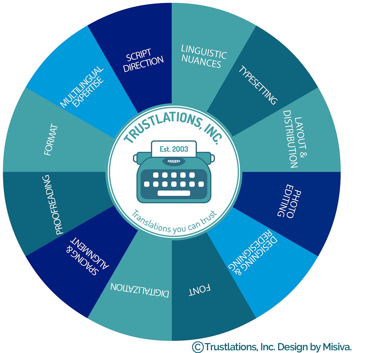 Here are some of the challenges faced in DTP when it comes to translated content:
• More content is produced;
• Less content is produced;
• The direction of the script;
• The intended audience;
• Designing: when there’s only text and stock imagery but no original design;
• Redesigning: when no editable file is available, a new file is created based on the non-editable design;
• DTP proofreading: when reviewing and correcting texts on a graphic version of a translated file;
• Digitalization: converting non-editable files into editable formats for CAT tool processing;
• Photo editing: images that need to be adapted to a different culture;
• Spacing & Alignment: properly distributing content to allow for a non-distracting reading experience;
• Font: a readable font with a size that the user does not have to zoom into or a universal font are considered when knowing the piece’s intended use; other typographic elements such as kerning, tracking, font weights need to be taken into account;
• Documents intended format: whether it is a digital document meant for an online PDF, an e-book, a banner, an ad, a post, a magazine, an ezine, an online or offline brochure, or a desktop- or mobile-version website, there are different factors to take into account.
After content has been translated from one language to another, typically, either more content is produced in the process or less content is produced. Due to this phenomenon, the new text has to be distributed and laid out using programs from the Adobe® package, such as FrameMaker®, PageMaker®, InDesign®, Photoshop®, Illustrator®, or even some from the Microsoft® package, such as PowerPoint®, or other graphic and layout applications in order to render a visually appealing and consistent product in the translated version.
DTP artists need to become experts in generating final copy for digital or print-ready materials. At times when the same amount of content (or words) is produced, the words themselves tend to be longer that the ones in the original texts. This often happens when translating from English into Russian, for example, forcing the DTP expert to redistribute the content within the confines of set margins. It’s quite tricky when trying to produce pieces that flow as well as the original.
In the case of translating from Spanish into English, typically less content is generated (sometimes up to 30% less), leaving the DTP expert with the challenge of “filling up” space or accommodating the visual content to create the right flow.
As mentioned earlier, the direction of the script presents obvious challenges. What to do when a document is originally in English (LTR) and is to be presented to a Chinese audience with a TTB requisite? The DTP typesetter is faced with solving the issue. The DTP professional must — even if they don’t speak the language — employ focus and stretch their comfort zone to accommodate the translated text and ensure the best results. This translates to actively thinking about the text that they are flowing into the document and not just flowing text without analysis.
In the case of Cyrillic Alphabet: this one is a bit harder, though it still reads LTR, sentence structure tends to be different than in Romance languages. However you still find the modernization of language apparent in most translations, such as in English into Russian. A DTP professional must find cues in the text to serve as a point of comparison for layout purposes. In this globalized world and in this line of business, we don’t all work in the same offices. In one of our documents it was useful to have the name of the city ‘Miami’ as this was a non-native word (in Russian) and is translated into Russian as ‘Майами’, which made it easy to spot for the DTP expert without having access to the translator under time pressure and being in different time zones. This term helped us find our way through the text.
In the case of Arabic, it is painstaking for non-native speakers. There may be no discernible subjects or descriptions as described above, as there might be for a translation, say from English into Portuguese (using the Latin alphabet). To make matters more difficult, Arabic is RTL; adjustments to settings must be made to design and layout programs in order to accommodate. Additionally, fonts may not have an Arabic version to offer continuity of style for the client and Arabic characters are much more organic and curvy, so traditional Western fonts need not apply. Usually, employing standard system Arabic fonts will get the job done; Regular and Bold will be your friends. Furthermore, Arabic characters tend to be shorter in height, thus the entire design can be affected by smaller-looking characters; a keen eye is required to achieve optimal composition and layout. Line breaks can be problematic as this is a common typographic tool when doing text layout; with Arabic it can be difficult to break lines to avoid “hanging” lines with a single word, which might not be as visually appealing.
French is the official language in nearly 30 nations[1]. This presents a challenge for the client who needs to determine which audience or audiences the communication is addressed to; a challenge for the translator(s) that will need to localize the content accordingly, and a challenge for the DTP specialist that may need to adapt images and typeset content differently depending on the audience.
 As far as redesigning goes, this presents unique challenges for a designer such as sourcing original high-resolution imagery (if applicable), original logo artwork and graphics. Recognizing typefaces and sourcing those font files can be a challenge as well as establishing the proper typographic elements such as kerning, tracking, font weights and font size. Overall redesign can represent doubling up on production time, so we must always try to negotiate with the original designer to procure source files whenever possible.
Most good typefaces and font families require licensing if used in commercial means and reproduction. Sourcing font files can be difficult; in most cases, good DTP professionals will know their way around typefaces and can establish original font files to complete the project. At times, this requires resourcefulness and great “Googling” skills.
Sometimes, the graphic designer will need to prepare an original document (prior to translation) from a non-editable version to an editable version that can be used in CAT tools (a software that segments texts in order to facilitate the translation process), such as TRADOS® or WordFast®. Images may need to be re-cropped and laid out, and text rearranged. After the translation is carried out, the DTP maven will have to typeset the new content so that it fits accordingly into the layout, which, once more, presents formatting, font, style and visual organization challenges.
The DTP designers take into consideration spacing and alignment so that the final piece is pleasurably readable. This requires digital craftsmanship that involves critical analysis in order to determine if the document will be viewed on a mobile device (phone, tablet or eBook reader) on a computer or on print. Information hierarchy, margins, resolution, tracking, kerning, font style, weight and size will all play an important role in this equation.
Just as typos and grammatical errors may deter a reader from engaging with interesting content, visual relevance can have that same effect. The process of translating content accurately and free of errors is as meticulous as that of a DTP expert; at Trustlations.com we make sure they become part of the same process with a sole objective in mind: delivering a flawless and captivating experience to the audience.
[1]https://en.wikipedia.org/wiki/List_of_territorial_entities_where_French_is_an_official_language